01
The challenge
SymGro was founded to help organisations align people with the processes that support them. The identity needed to express sustainable growth, connection and balance without falling into generic consultancy imagery.
Brand identity and digital system
Role
Brand strategy, identity design, logo construction, colour system, applications and digital direction.
See it in action ↗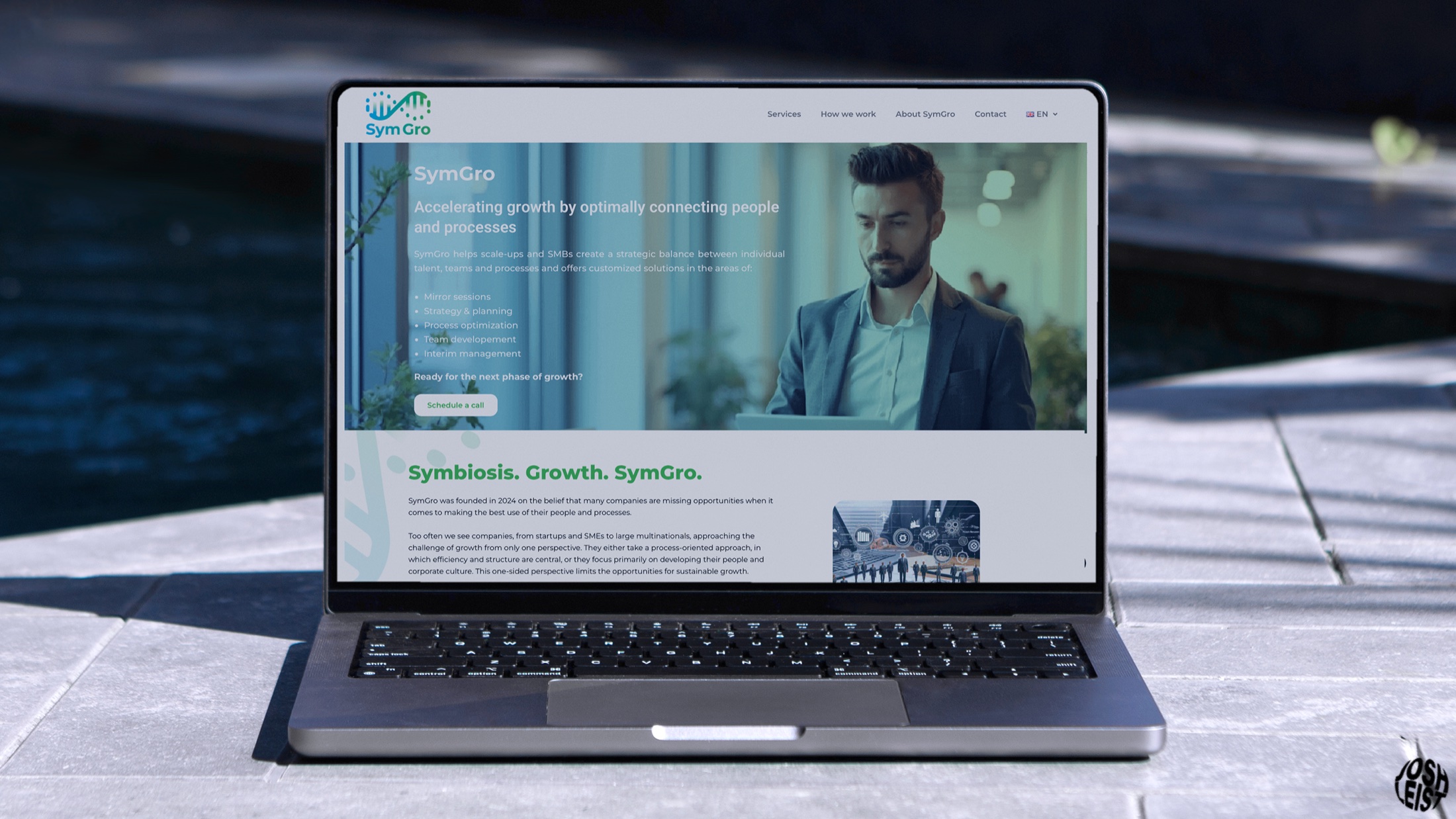
01
SymGro was founded to help organisations align people with the processes that support them. The identity needed to express sustainable growth, connection and balance without falling into generic consultancy imagery.
02
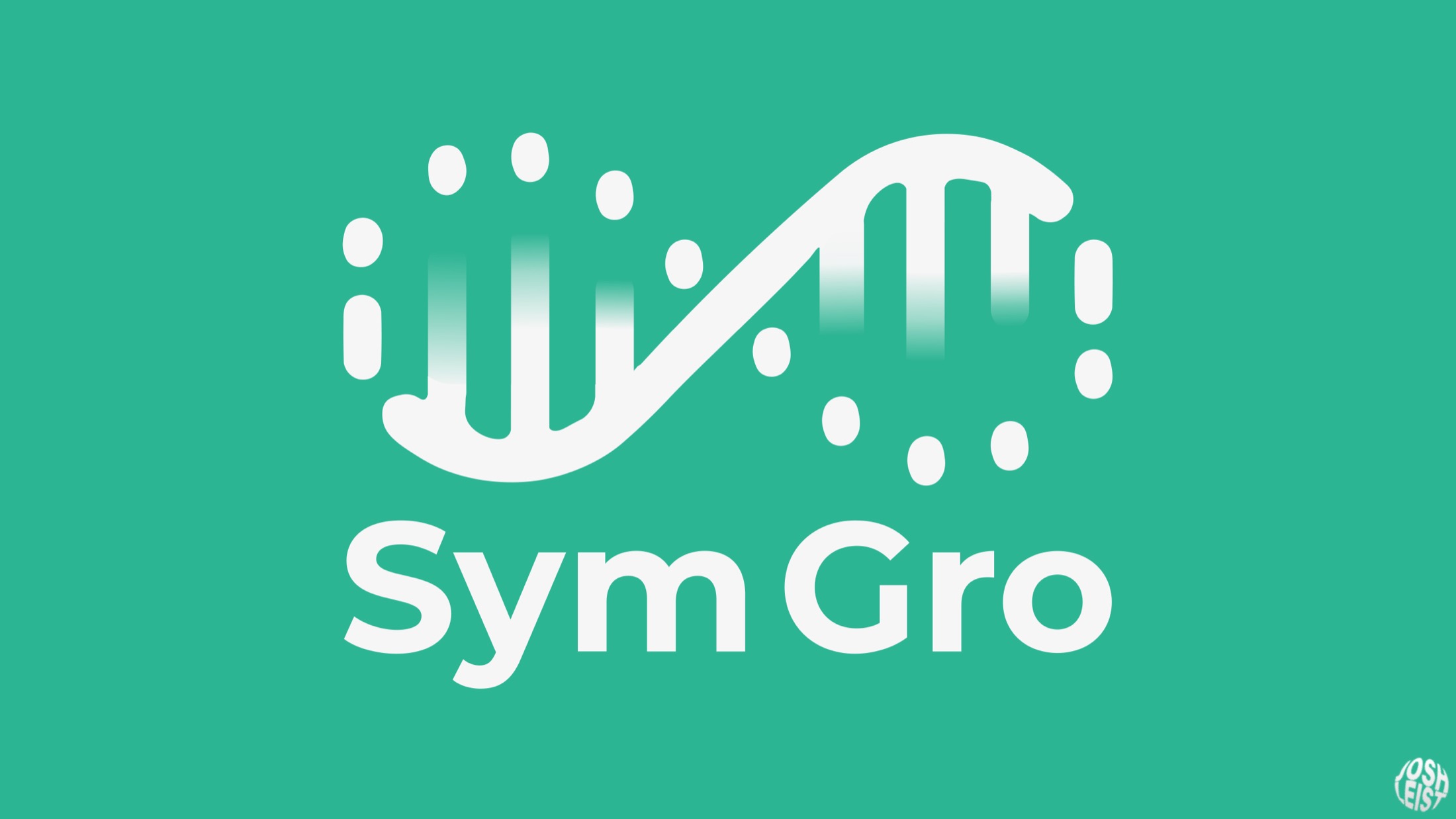
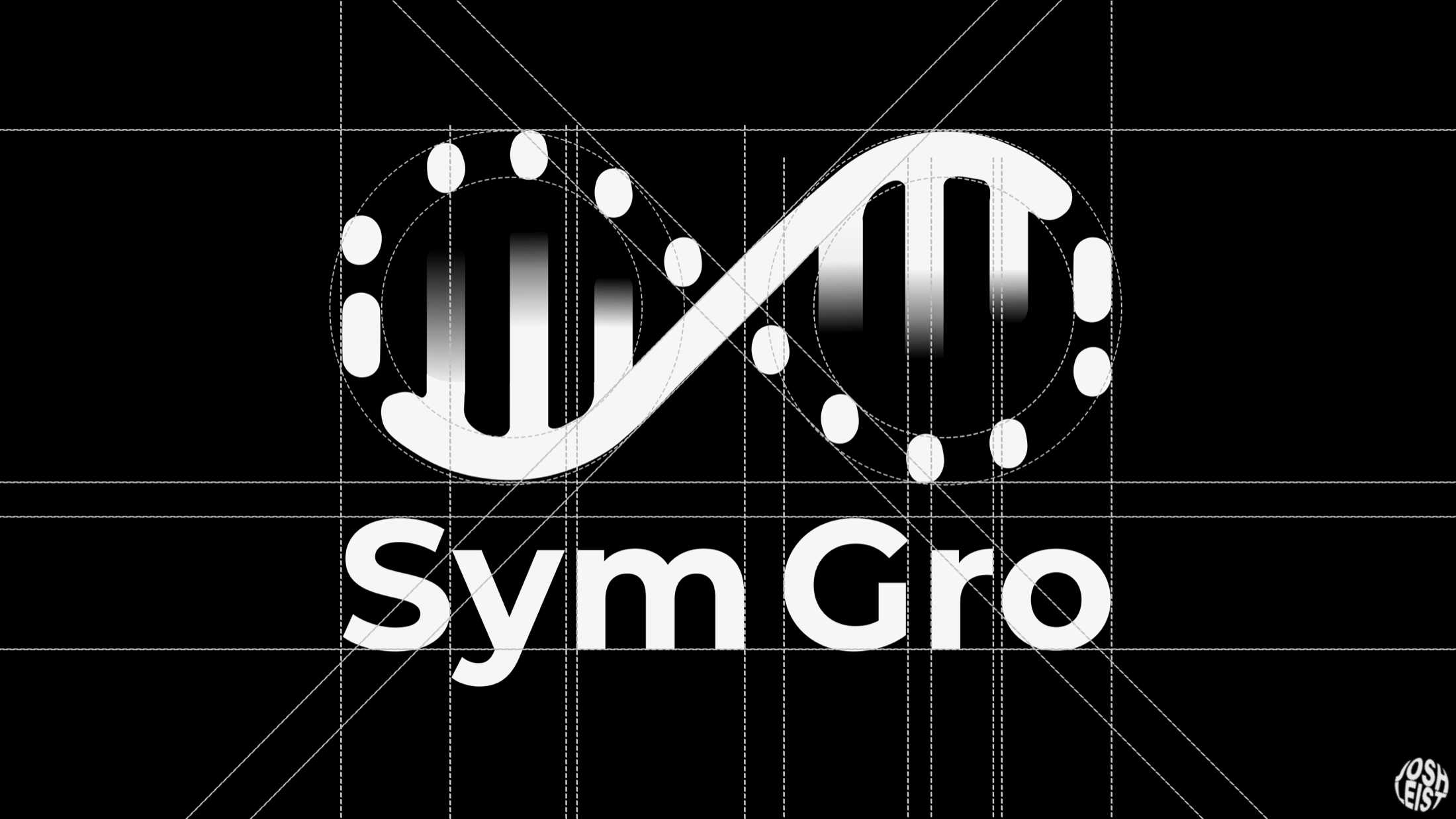
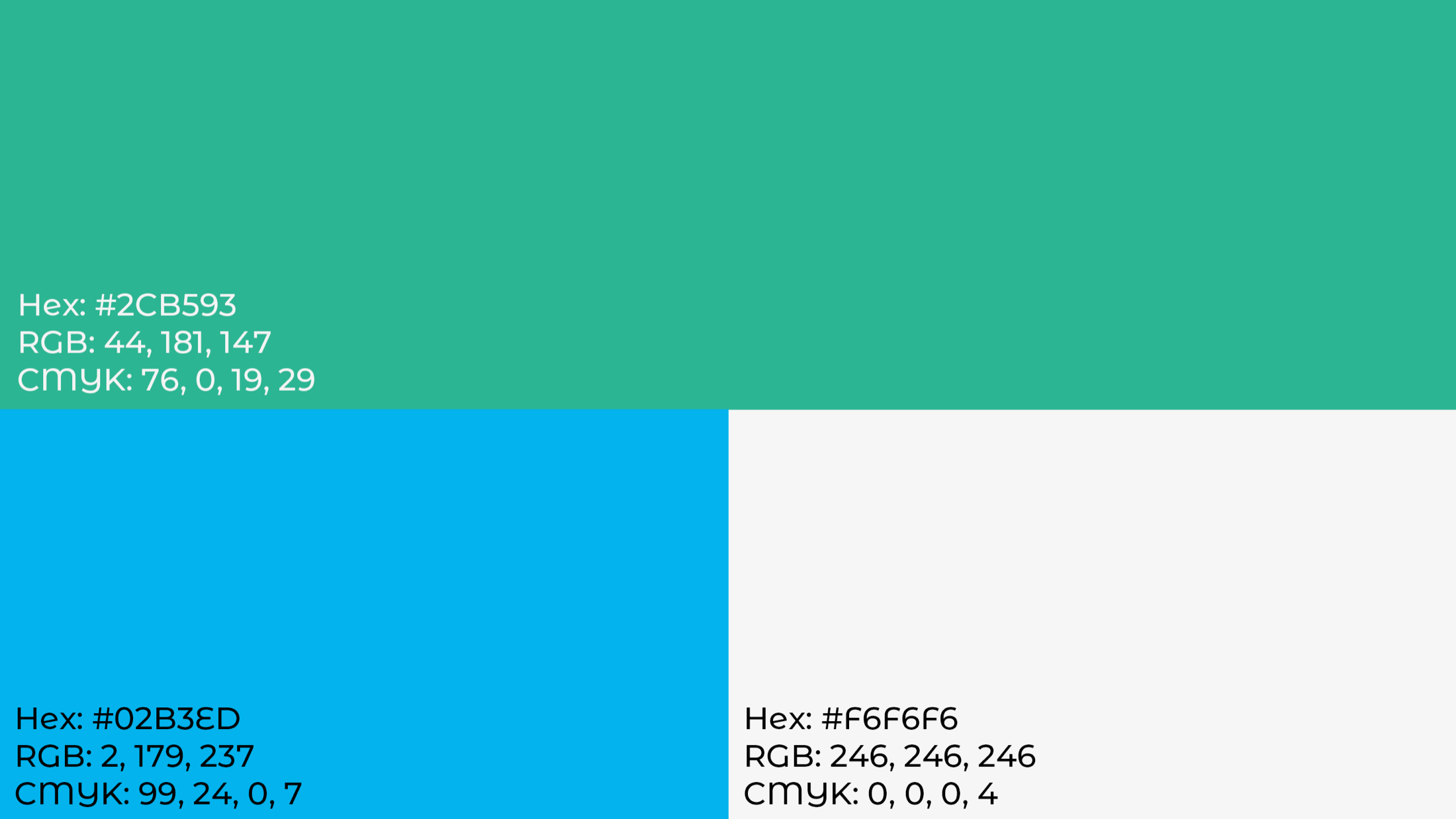
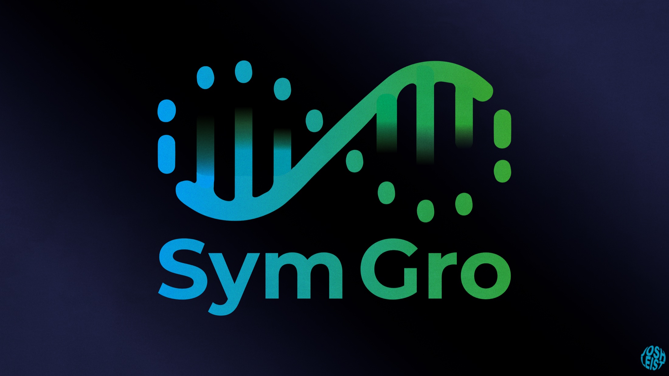
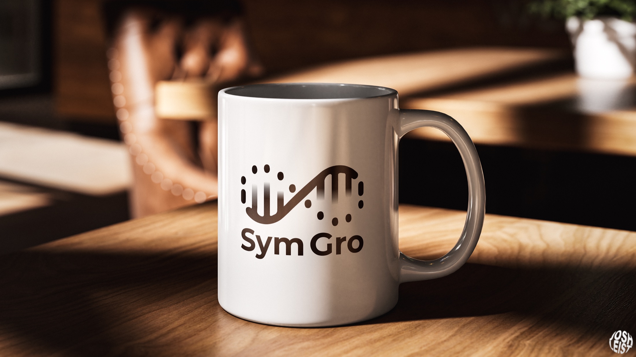
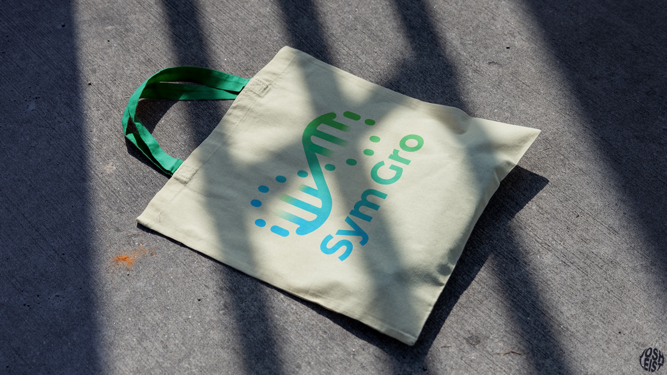
The mark combines an infinity loop with a DNA-inspired rhythm: a continuous system where human potential and structured process move together. Green represents people, blue represents process and cyan creates the bridge between them.
03
A clear, modern identity that moves confidently from a compact symbol to digital interfaces, presentations and physical brand applications.
04
The central idea stays legible across every format. The symbol carries the strategy on its own, while the colour system gives the wider brand enough range for practical communications.
In detail
01—06
A closer look at the interface, core forecasting tools and the product working across real phone screens.